Editorial Disclaimer
The views expressed in articles published on FIRES do not necessarily reflect those of IES or represent endorsement by the IES.
By Jason Livingston, Michael Royer, Tony Esposito
Hopefully, you have heard of TM-30 by now. ANSI/IES TM-30-18, IES Method for Evaluating Light Source Color Rendition provides a robust suite of metrics that convey much more information than any previous attempt at characterizing color rendering. To some, this presents a problem: we have heard some people say there are too many numbers and it’s not clear how they should be used. While the lack of specification guidance in the past was for good reason—pending research linking the scientifically accurate metrics to subjective visual outcomes—the situation is now quite different!
The IES recently published TM-30 Annex F, which reviews and summarizes five studies that explored using TM-30 metrics to predict subjective visual outcomes.1-5 More importantly, TM-30 Annex E uses the research, along with other analysis and consensus-based decision making, to establish a straightforward set of recommended specifications that are applicable to most interior lighting situations.
As specifiers and manufacturers transition from CRI to TM-30, these specifications should result in tangible changes across the industry. Manufacturers have an opportunity to fill gaps in the market by delivering products that previously would have been challenging to specify but that are now clearly categorized, and thus marketable. Engineers, architects, lighting designers, and other specifiers now have evidence-based ANSI metrics and specification criteria, so they can be more purposeful in the color rendering performance they want, instead of leaving it up to chance. Owners’ and users’ expectations can be clearly described and satisfied by appropriate products. Everyone comes out ahead.
Table 1 is replicated from Annex E and provides recommended specification criteria for three different design intents: Preference, Vividness, and/or Fidelity. For each design intent, specification criteria are given for three priority levels. Priority Level 1 has the strictest requirements; therefore, it is the most likely to satisfy the design intent but also has the fewest qualifying products, which may also have lower efficacy. Priority Level 3 has the loosest range of values, and products at that level are less likely to meet the design intent—although they are likely to achieve the intent at an equal or higher rate than the majority of existing commercial sources intended for use in architectural interiors. It is up to the specifier to determine the project’s requirements and select the appropriate design-intent/priority-level combination(s).
Combining the first letter of the design intent with the priority level number provides a simple shorthand method of connecting a light source’s color rendition performance to the nine specifications in Table 1. For example, a P1 light source meets Priority Level 1 criteria for the Preference design intent, an F2 meets Priority Level 2 for the Fidelity design intent, and a “V-” is source that does not qualify for any priority levels for the Vividness design intent. Importantly, priority levels are downward compatible; thus, a product meeting Priority Level 1 will always meet the requirements for Priority Level 2, and so on. As such, the highest priority level achieved should always be reported.
Table 1. Recommended Specification Criteria from IES TM-30 Annex E Based on Design Intent and Priority Level
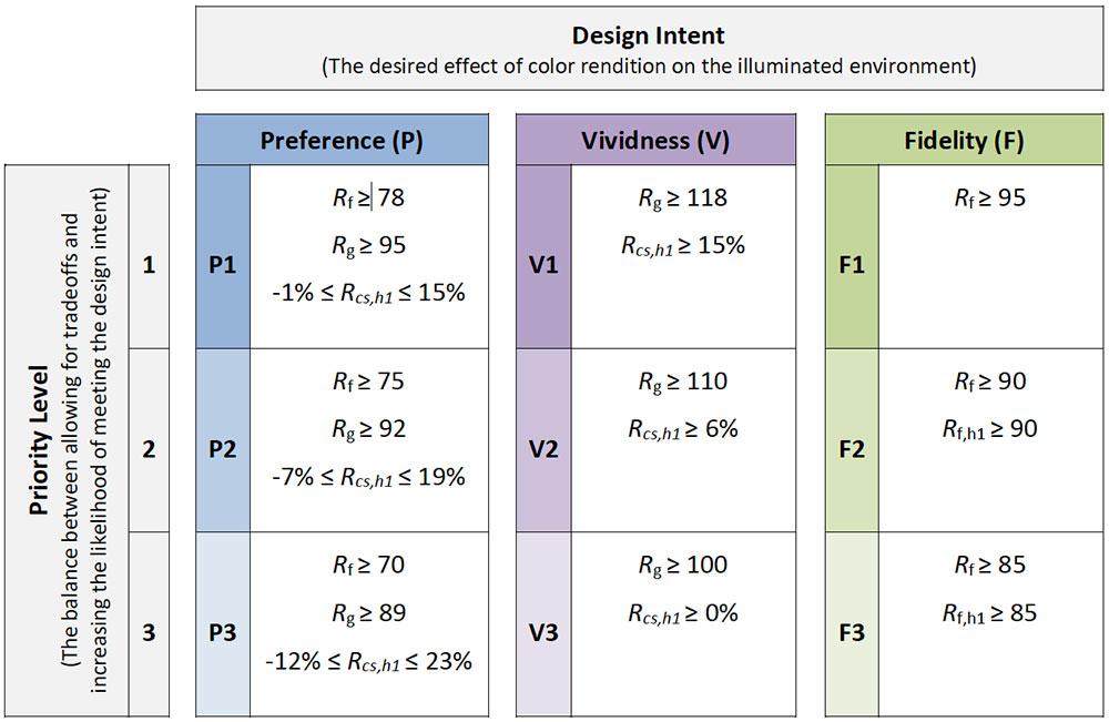
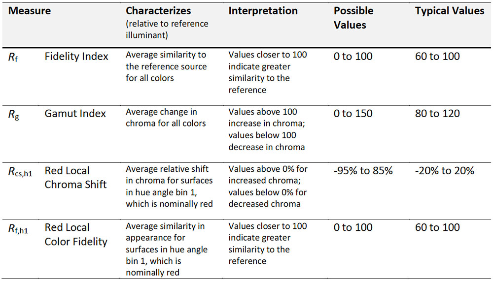
To make use of Table 1, specifiers need to track just four of the many TM-30 measures: Rf, Rg, Rcs,h1, and Rf,h1. For quick reference, each of these measures is described further in Table 2. Of course, power users can continue to dive deeper into the TM-30 offerings. While four is an increase compared to the one or two measures that have previously been used to specify color rendering, the additional value provided is documented and defendable, as illustrated in the descriptions of the three design intents that follow.
Table 2. Description of the Four Measures from TM-30 Included in Table 1
The Preference design intent captures subjective evaluations of pleasantness, naturalness, acceptability, and related qualities, and may be the dominant color rendition design intent in retail, office, hospitality, and residential lighting applications. The TM-30 measurements used to predict preference are Rf, Rg, and Rcs,h1. Highly preferred light sources cause color shift relative to their reference source primarily by increasing the saturation of reds, which has long been shown to be a very important factor in color evaluation and in psychology in general.1-10 The increase specifically counteracts a dulling effect that occurs with reduced illuminance (the Hunt Effect), thus making colors appear more like they do under the reference illuminant at the illuminance level of outdoor viewing environments.11-13 Because of this, preference cannot be conveyed with measures of color fidelity alone; Rcs,h1 and Rg are critical additions to the specification. Without them, preference (and vividness) are left to chance, with dull or saturated colors both possible at a given Rf value (and specifically for reds with Rf,h1). In reality, that chance is not 50:50, since optimizing for luminous efficiency encourages manufacture of commercial light sources with significantly desaturated reds (Rcs,h1 < 0%, and usually Rcs,h1 < -10%). This was a staple of fluorescent lamps, and LEDs have followed the same path.
While most people don’t complain about the color rendering of today’s lighting technologies, they often become dissatisfied when shown alternatives. As a result, the recommendations place the majority of currently available LED, fluorescent, and ceramic metal halide products intended for interior applications into the P3 specification. This provides an opportunity for light source manufacturers to develop products specifically targeting higher levels of preference and for specifiers to increase the satisfaction of building occupants. Some products are already available in the P2 and P1 specifications. Both standard incandescent and neodymium incandescent lamps fall in the P1 specification.
For Preference, Priority Level 1 is intended to include spectral power distributions (SPDs) that 90% of people find acceptable in general applications. For Priority Level 2, 80% of viewers are likely to find color appearance acceptable, and Priority Level 3 equates to about 65% of viewers finding the lighting acceptable.
The Vividness design intent captures subjective evaluations of color vividness, saturation, or vibrancy and may be the dominant color rendition design intent in some entertainment, display, or retail applications. The TM-30 measures used to predict vividness are Rg and Rcs,h1. The Vividness design intent focuses only on increasing color vividness, and targets above-average performance. It is important to keep in mind that light sources enhancing vividness can also distort hues, especially in the V1 specification, so large increases in vividness may not be viewed as natural or preferred. Furthermore, perceptions of vividness increase continuously with increasing Rcs,h1 or Rg. This is not true for perceptions of preference; perception of preference plateaus (and eventually starts to decline), which is why the Preference criteria have an upper bound on Rcs,h1 and the Vividness criteria do not.
Majorities of currently available white phosphor-converted LED and fluorescent lighting fall outside of the Vividness specifications, although some products achieving up to V2 exist. At present, the V1 specification is most easily achieved using color-mixed LEDs (e.g., RGB, RGBA, RGBW).
The Fidelity design intent captures the match between a test light source and its reference. Note that fidelity should not be considered equivalent to naturalness, a common misconception. The TM-30 measurements used to predict color fidelity are Rf and Rf,h1. The use of Rf,h1 is conceptually equivalent to using R9 alongside Ra (CRI), giving an extra level of control for reds, but the TM-30 measures are a more accurate representation of human color vision. High levels of color fidelity minimize all types of color shifts relative to the appearance under a reference illuminant (at equal illuminance) and may be an important design intent for applications such as health care and color matching. The priority levels begin at Rf ≥ 85 and Rf,h1 ≥ 85, which is higher than levels typically used in the past. Specifying a higher color fidelity threshold aids in reducing the amount of variation possible among qualifying light sources, helping to ensure consistency.
Majorities of currently available white phosphor-converted LED and fluorescent lighting fall outside of the Fidelity specifications, but products in all three priority levels do exist. A standard incandescent or halogen lamp meets the F1 specification, for example, whereas a neodymium incandescent lamp meets the F3 specification.
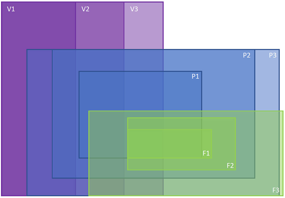
Figure 1 shows that the P, V, and F design intents are not independent and that it is not possible to achieve P1, V1, and F1 simultaneously; however, many other PVF combinations exist. For example, it is possible to simultaneously achieve any level of Preference and Fidelity at the Vividness Priority Level 3 (e.g., P1, V3, F1). Likewise, it is possible to achieve P1, V2, F3.

It’s important to note that none of the design intents or priority levels is specifically recommended for any application. Decisions about the combination of design intents and priority levels are left to the specifier and are subject to the unique requirements of each project. Some projects may even fall outside of this framework.
So, how would a specifier use Annex E information in practice? It’s relatively straightforward.
Step 1. Determine the design intent(s) and priority level(s) of the project’s color rendering requirements. For example, the specifier of a high-end retail project may determine that the color rendering goals of P2 and F1 are appropriate.
Step 2. Look at the Rf, Rg, Rcs,h1, and Rf,h1 criteria; where multiple criteria occur, use the stricter criterion. In the high-end retail example above, those criteria would be:
- Rf ≥ 95
- Rg ≥ 92
- Rcs,h1 -7% to 19%
Step 3. When evaluating light source options, seek out and specify those that meet the above color rendering criteria. TM-30 data is currently published by some manufacturers, and they all should be able to calculate it, since the method uses the same input (an SPD) as other basic color quantities, like CCT. If manufacturers won’t provide TM-30 data, request the source’s spectral power distribution (actual numbers by wavelength, not a graph) since that is all that is needed to compute the TM-30 values. With SPD in hand, load it into the IES TM-30-18 Calculation Tool, and values will be computed. Data should become more readily available as IES TM-30 is integrated into institutional specifications (e.g., WELL) and product qualification programs (e.g., ENERGY STAR and the DesignLights Consortium Qualified Products List).
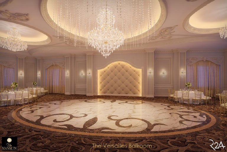
Let’s look at a real example where TM-30 Annex E was used. The ballroom shown in Figure 2 is part of a recently renovated facility that caters to high end weddings. The owners stressed the need for warmth, romance, and beauty in the lighting and interior designs. The designers determined that Preference was the main color rendering goal and sought out fixtures that met the P1 specification. Color fidelity was also an important consideration, as hue shifts in any wedding’s color palette would be unacceptable. Therefore, a second color rendering criterion of F2 was established. The dual P1, F2 criteria were:
- Rf ≥ 90
- Rg ≥ 95
- Rcs,h1 -1% to 15%
- Rf,h1 ≥ 90
(Courtesy of R2Architects)
Other decisions made during the design period included use of dim-to-warm downlights, wall washers, and accent lights, use of chandeliers and wall sconces with LEDs of 2700 K, and use of RGBW cove fixtures for color flexibility. The designers sought a family of recessed dim-to-warm fixtures from a single manufacturer. Some manufacturers were able to provide TM-30 data that could be used to determine whether the Rf, Rg, Rcs,h1, and Rf,h1 requirements could be met. Other manufacturers provided working samples so the designers could measure the light output with a handheld spectroradiometer. This color rendering information was considered alongside criteria such as optical performance, efficacy, dimming range, and fixture cost to determine the optimal manufacturer and product line for the project.
What happens if your project doesn’t meet the assumptions of Table 1? Annex E also provides guidance on the factors that influence color rendition specification, aiding in the development of new specifications or modifications of those in Table 1. For example, if only green foliage is to be illuminated, Rcs,h7 (green chroma shift) may be more important than red chroma shift. The same could occur for illuminating the logo of any particular brand—the object(s) are not polychromatic, so choosing a metric specific to the nominal color is appropriate.
Another common situation in architectural lighting is illuminance levels below 200 lux. As illuminance is reduced, increasing chroma (particularly for red) to counteract the Hunt Effect is necessary to make the scene appear as expected. In low illuminance situations, the minimum levels for Rcs,h1 could be raised. Even when meeting the assumptions of Table 1, the review in Annex E may also be useful for choosing which of the nine recommended specifications are most appropriate for a specific installation.
For too long, color rendering meant color fidelity because that was the only type of metric we had. With TM-30 and the specification categories in Annex E, the lighting community now has a better way to articulate color rendering goals and greater assurance of meeting them. Don’t take our word for it, though. As so many participants in the TM-30 Experience Room at this year’s IES Annual Conference discovered, seeing is believing. We are in discussions with IES staff to develop either a roadshow or a demo kit that would be made available to the sections. If you have the opportunity before then, attend TM-30 presentations that include demonstrations of Annex E.
References
1. Royer M, Wilkerson A, Wei M, Safranak S. Experimental validation of color rendition specification criteria based on ANSI/IES TM-30-18. Lighting Res Technol. 2019; Online before print. DOI: 10.1177/1477153519857625.
2. Royer MP, Wilkerson A, Wei M. Human perceptions of colour rendition at different chromaticities. Lighting Res Technol. 2018;50:965-94. DOI: 10.1177/1477153517725974.
3. Royer MP, Wilkerson A, Wei M, Houser K, Davis RJ. Human perceptions of colour rendition vary with average fidelity, average gamut, and gamut shape. Lighting Res Technol. 2017;49:966-91. DOI: 10.1177/1477153516663615.
4. Zhang F, Xu H, Feng H. Toward a unified model for predicting color quality of light sources. Appl Opt. 2017;56:8186-95. 2017/10/20. DOI: 10.1364/AO.56.008186.
5. Esposito T, Houser K. Models of colour quality over a wide range of spectral power distributions. Lighting Res Technol. 2019;51:331-52. DOI: 10.1177/1477153518765953.
6. Rea MS, Freyssinier JP. Color Rendering: Beyond Pride and Prejudice. Color Res Applic. 2010;35:401-9. DOI: 10.1002/col.20562.
7. Wei MC, Houser KW. Systematic Changes in Gamut Size Affect Color Preference. Leukos. 2017;13:23-32. DOI: 10.1080/15502724.2016.1192402.
8. Wei M, Houser K, David A, Krames M. Effect of gamut shape on color preference. Proc CIE 2016 Lighting Quality and Energy Efficiency. Melbourne, Australia. Vienna: International Commission on Illumination. 2016:32-41.
9. Wei M, Houser KW, David A, Krames MR. Colour gamut size and shape influence colour preference. Lighting Res Technol. 2016;49:992-1014. DOI: 10.1177/1477153516651472.
10. Elliot AJ, Maier MA. Color psychology: Effects of perceiving color on psychological functioning in humans. Annu Rev Psychol. 2014;65:95-120. DOI: 10.1146/annurev-psych-010213-115035.
11. Bao W, Wei M. Change of gamut size for producing preferred color appearance from 20 to 15000 lux. Leukos. 2019:1-22. DOI: 10.1080/15502724.2019.1587621.
12. Wei M, Bao W, Huang H. Consideration of light level in specifying light source color rendition. Leukos. 2018. Online before print: DOI: 10.1080/15502724.2018.1448992.
13. Hunt R. Light and dark adaptation and the perception of color. J Opt Soc Am. 1952;42:190-199. DOI: 10.1364/JOSA.42.000190.
